Prototype Complete!
Player feedback and actions
Here are my results from getting feedback on the two variants:
- Overall, opinions were pretty mixed on all the questions.
- Some found the bears helped, some found them distracting. Some felt they added engagement and cuteness, some preferred the minimalist puzzle aesthetic.
- Some people preferred the satisfaction of "tidying" the grid into a single colour, some preferred making the grid colourful.
The biggest question mark was over the intuitiveness, and whether RYB or the linear colour scale felt better. The majority of people found the linear scale harder to understand and more arbitrary. That said, several people also found the RYB version somewhat unintuitive. What to do about that?
I pondered whether to drop the prototype or change the concept completely. For example, it would be possible to make the linear version something other than colours, as one tester pointed out, since it's merely adding and subtracting numbers within a min/max, and I did play around with alternative representations on paper. However, I felt that this missed the point of the RYB version, i.e. that the colours are connected in a circle. The RYB version also creates situations where the order of block placement is part of the puzzle, which I think adds an extra challenge (at the risk of hampering intuitiveness).
So, I decided to go ahead with the RYB version, making a few improvements that might help make the colours more intuitive, but at the same time accepting that the core idea might be flawed, and certainly for some players it will always feel wrong.
The changes I decided on were:
- To keep the bears, but make them square to better fit the grid, and reduce their opacity so they aren't so distracting
- To alter the colours so they mix in a more realistic way
- Especially the brown, which is likely a key source of confusion. I tried to limit the need for the player to make brown as much as possible - it's rarely a start or target colour in the puzzles
Finally, I kept the "tidy up the grid into a single colour" version for the first few levels, while the player gets used to the mechanic, and then switch it to "now match the pattern". I had a realisation as to why these two are different and why the latter feels harder, and that's because the "match the pattern" version gives you more hints as to how to reach the solution.
For example, consider these two similar puzzles:
The second initially seems less complex. However, because I'm forcing the player to make the whole grid purple, they are having to do the mental calculation between the shapes on the right and the grid before they can make a single move. In the first example, the target pattern contains clues that makes this much easier - they can see a red and a blue corner, which gives an obvious hint as to the placement of some of the blocks. There's no way to do this in the second version, because there is no connection between a red tile being on the main grid and a red shape needing to go there.
It's worth noting as well that I can't simply "reverse" a level by picking "opposite" colours to change it from starting with a solid colour block to ending with a solid colour block. This is because the system intentionally only gives you primary, not secondary colours, as placement blocks - you are never mixing secondary colours with other secondary colours. As mentioned, the order of placement can also be a factor, so can't be directly reversed.
Puzzle elements
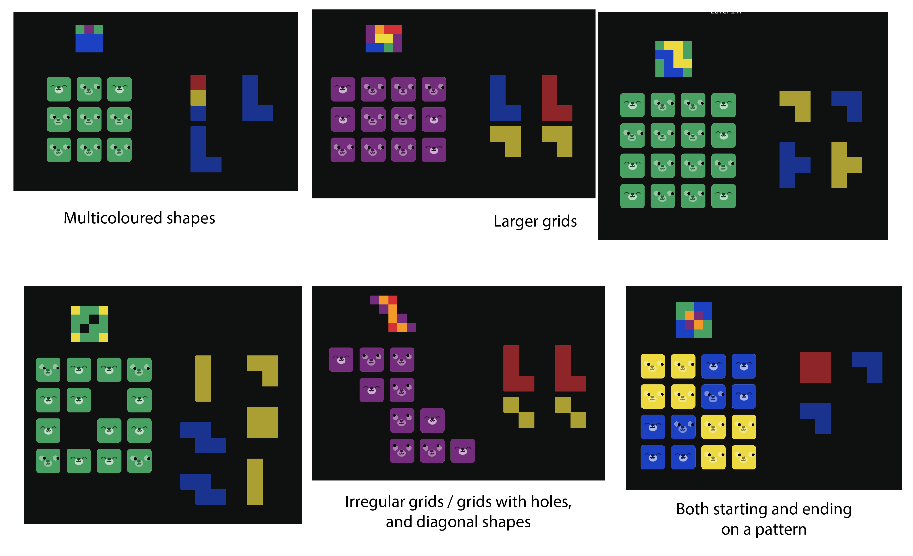
In the end I built 20 levels, experimenting with a number of different mechanical variations:

Level design process
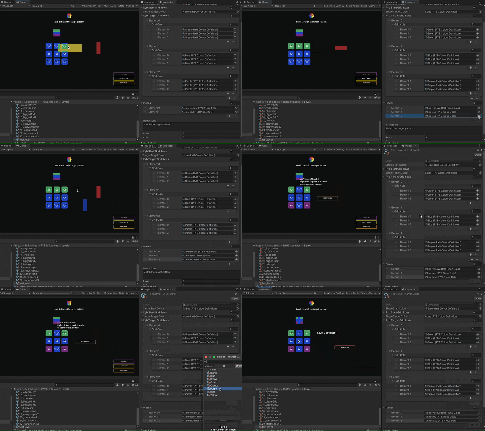
The last thing I want to touch on as a learning is how useful it's been to use scriptable objects to define all the level data. In most of my past games there's been some aspect of wanting to position and lay things out on a screen (e.g. in the cogs game), and I always felt the need to fiddle around with those in the Unity editor, either in their own scenes or prefabs. However, with a grid I didn't feel this necessary, and using scriptables ended up making my process infinitely smoother. Instead of having to hit play/stop in Unity all the time, and/or making changes in play mode that I then have to remember and change after, my process can be done completely in play mode:
- Set up a new scriptable object level with a plain grid and whatever shapes I want to experiment with
- Keep iterating, tweaking the setup of the start grid (if needed) and which shapes I'm using, and hitting the in-game "reset" button
- Once I've made a pattern I'm happy with I just edit the "target grid" on the scriptable object to match the result
This is another reason why using a target pattern, rather than a grid of solid colour, was a good choice - it doesn't require me to do any reverse engineering of a solution in order to design the level setup.

That's It!
I'm satisfied with the version of the prototype now up, and won't be making additional changes for now (except bug fixes if needed). Although the mechanic doesn't have a ton of depth to it, I'm happy with this as a game that provides a gentle challenge and the fun of making little patterns. On to the next one!
Files
Bear Blocks
Colourful shapes grid puzzle
| Status | Prototype |
| Author | Kate Killick |
| Genre | Puzzle |
| Tags | 2D, blocks, Colorful, Cozy, Cute, Minimalist, relax, Singleplayer, Tetris |
More posts
- Versions For TestingFeb 21, 2022
- Forks in the roadFeb 21, 2022
- First IterationFeb 16, 2022
Leave a comment
Log in with itch.io to leave a comment.