Forks in the road
I got myself into a slight pickle since the last journal entry.
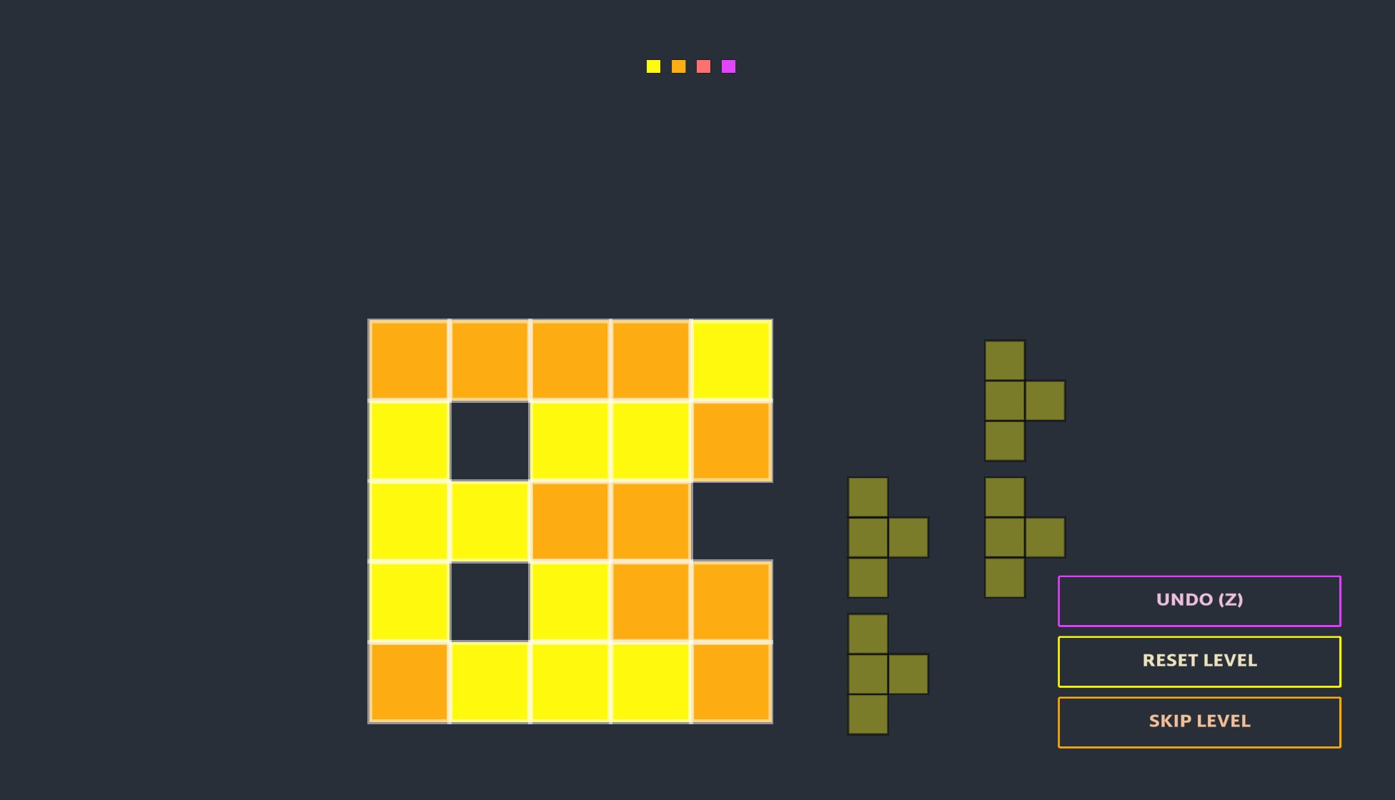
To summarise, I started to add new functionality to the game. I first added support for irregular grids (i.e. grids of any size, with the ability to have missing blocks), though I’ve yet to create any levels to see how this impacts gameplay.

That’s because I then moved onto, and got distracted by…
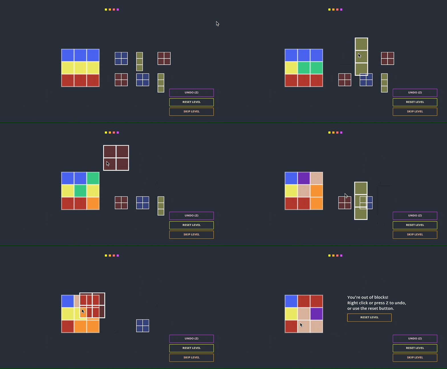
Changing from a linear colour scale to a RYB (red/yellow/blue) system.
I mentioned this as an idea in my last post, and I decided I needed to try it to see if it felt intuitive. I wanted to keep support for both versions in the game for now - first, I didn’t think RYB would be good and I’d probably want to revert back to linear. If it did turn out to be interesting, I thought it might be a layer that comes in later gameplay. Now I realise that’s a very bad idea, as it’s confusing to switch between them, and also having both systems is causing a mess.

Next, I added support for levels to work in one of two ways:
- The player starts with a multicoloured grid and must get it to a single colour (as per the first iteration)
- The player starts with a grid of all one colour, and is shown a target image of what they need to create
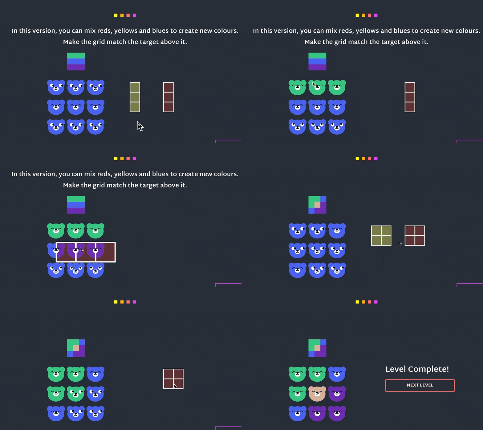
Finally, on Friday I decided to take a break from the puzzle design aspect and see if adding a visual theme to the game was a good idea, again, expecting that it probably wouldn’t work well. Here you can see a version with bears, using RYB, and also with the colour target above the main grid.

I now have at least two separate games within this prototype, and need to evaluate which directions to keep and which to scrap. To do that, I need to determine the pros and cons of each of these features, which is difficult because there are multiple variables.
Questions I need to answer:
- Does RYB feel better than linear colour? (So far, I think it’s more intuitive, but I can’t tell if it actually limits the puzzle design)
- Is one system of having the starting state -> end state better than the other? (i.e. full colour grid to multicolour grid, or the other way round). Is one more intuitive? More satisfying? And will I ever want to have a grid that both starts multicoloured and ends multicoloured? Current assumption is that flexibility will still be needed here.
- Bears? They are cute and probably make it more intuitive (feels more like looking through coloured glass) - but I’m having trouble letting go of the minimalist style.
How can I answer these questions?
The best way I can think of is to distil it down to two distinct options and put both versions up for playtesting.
Version A , based on the first iteration:
- Linear colour scale
- Level goal will be multicolour grid -> full colour grid (ideally I’ll show the target colour, this will need some extra code)
- No bears (they aren’t supported in this mode)
Version B, based on the latest iteration:
- RYB colour mode
- Will probably try to include both ways round for the level goal (I need to make some new levels)
- I guess bears, for comparison
Hopefully I can get both these versions up by tomorrow and start to get useful player feedback.
Bear Blocks
Colourful shapes grid puzzle
| Status | Prototype |
| Author | Kate Killick |
| Genre | Puzzle |
| Tags | 2D, blocks, Colorful, Cozy, Cute, Minimalist, relax, Singleplayer, Tetris |
More posts
- Prototype Complete!Feb 23, 2022
- Versions For TestingFeb 21, 2022
- First IterationFeb 16, 2022
Leave a comment
Log in with itch.io to leave a comment.